All posts by admin

Featured Client

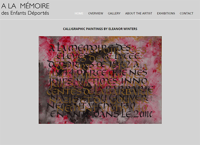
À la Mémoire des Enfants Déportés


92c84ebe-253c-4874-a233-4f9e92a15046
We developed the À la Mémoire des Enfants Déportés website for Eleanor Winters, a talented and caring calligrapher who created unique art to memorialize the sad fate of Jewish children in World War II France. During the war, 11,400 Jewish children were deported from Nazi-occupied France. Most of them died in the German concentration camps. Eleanor’s works take the words from plaques put up throughout the city of Paris after the war. There have been more than 1,000 such plaques erected. Eleanor continues to exhibit this work in special shows around the world.

Take a look at the À la Mémoire des Enfants Déportés website at: www.alamemoireparis.com.

Newest Work

Here are some of our recent projects:

Jewell Law, PLLC – We designed and built a major new website for this New York-based matrimonial law firm. Their attorneys provide legal assistance to high net worth individuals and couples including: divorce, separation, pre- and post-nuptial agreements, property distribution, child custody, child support, spousal support and post-judgment services.
www.kenjewell-law.com

Steven Horowitz, Esq. – Newly relocated to Israel, patent attorney Steven Horowitz, was launching an advertising campaign for his practice. We build a special responsive one-page landing site for him to use in his ads. Take a look:  www.patentny.com/patent

Email Tip

Don’t Use Subject Lines that Resemble Spam

Instead of coming across as an unsolicited mass marketer, business and sales emails need to seem like one-on-one communications, even if they are mass mailings. If you ever hope to get a positive response, strive to have your emails resemble personalized notes that feel like one-on-one conversations.

When you see an email in your inbox that looks like a sleazy marketing offer, the first thing you do  is to delete it (or mark it as spam). That’s why one of the worst things you can do is write a subject line that looks like an aggressive sales pitch to the world.

Instead, try to make it friendly, personal and relevant to the recipient. For example, rather than saying “Get a FREE White Paper!!” try something more like “Here’s an article on racial injustice that I thought you might find interesting.”

Some common indicators of mass marketing emails include capitalizing the first letter of every word (or even all capital letters), using trigger words like free, save, click, and offer, along with ending subject lines with one or more exclamation points.

Remember, the biggest barrier to getting your message across with email is the subject line. If you can’t entice your reader to want to see what’s inside, they will never open your email and receive your message.

Featured Client

Divorce Mediation Solutions

divorce-mediation

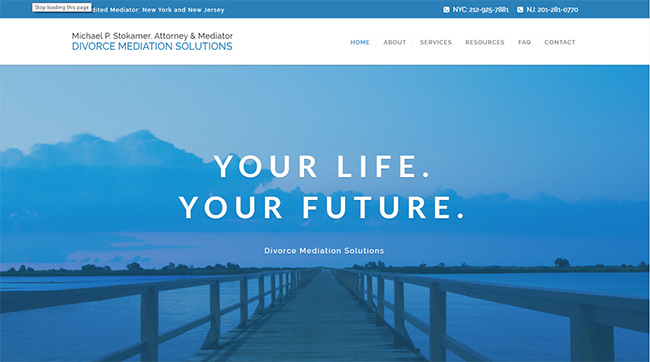
Divorce Mediation Solutions was founded by attorney Michael P. Stokamer to provide separating and divorcing couples with an alternative to a traditional, costly and acrimonious divorce. Michael helps New York and New Jersey couples to resolve their differences peacefully and with dignity using legal separation and divorce mediation or collaborative divorce services.

Nexxite combined branding, copywriting, sophisticated design and advanced technology to form a beautiful and coherent website presence for Michael’s firm. We are proud to say the site has been used in presentations at legal conferences as an example of an excellent legal website.

Take a look at Divorce Mediation Solutions at:  www.divorcemediationsolutions.com

Newest Work

Here are some of our recent projects:

John Sabasteanski – We built the website for this multi-talented artist and woodworker. A graduate of the Rhode Island School of Design, John designed the site. Our job was to build it per his specifications. It has an unusual, almost “un-designed” quality, requiring the visitor to explore for himself. www.johnsabasteanski.com

Danziger & Markhoff LLP – We replaced a confusing, out-of-date website with a modern, well-organized and technically advanced one for this established law firm with offices in Westchester and Long Island. A unique legal and actuarial enterprise, Danziger and Markhoff combines the skills of a dozen attorneys with approximately 40 actuaries, plan consultants and other professionals. The firm focuses on business and tax law, pensions, ESOPs, retirement plan administration and other areas including healthcare law, real estate and trusts and estate planning.  www.danzigermarkhoff.com

AMilan European Hair Design – We created a mobile website our long-time client, Angel Chizzoniti, who provides hair restoration and other related services to clients in New York. We also did a basic SEO project for Angel to facilitate being found in Google searches. www.amilanhairdesign.com

What is a “Modern” Website?

We are often asked to create a “modern” or “state-of-the-art” website, but what does that really mean? We put together our thoughts on the subject and came up with a number of characteristics that we feel define today’s websites.

First and foremost, modern websites are responsive. Because over half of Internet traffic worldwide is now on smart phones, rather than desktop computers, websites must be built to be readable on these much smaller screens. Gone are the days when you had to pinch the screen on your phone to expand the text so you could read it. Today’s websites adapt to whatever screen they are viewed on so they are easily read and navigated on any device.

Most newer websites are designed to fill the full screen width. Newer sites are rarely set inside a box with a white or colored (or patterned) field surrounding them. This tends to create a more immersive experience for the viewer.

More and more websites utilize motion. Simply put, people love videos. Bandwith has gotten so much greater in recent years that loading time is no longer a major problem on most computers and phones. Of course, a very slow loading site is not good, so huge videos are not recommended, but certainly a video up to 50 Meg or so is fine. And it isn’t just videos, it is motion of any kind that people look for nowadays. Motion graphics, small animations, tastefully used (and not over-used) are increasingly popular.

Next is interactivity. Websites are far more effective if they can capture and retain viewers. One way to do this is to involve them in an active website experience. So, clicking and downloading an article, turning pages to read a story, playing a game, getting a free product sample, or completing a form are just a few of the techniques modern sites are using to engage visitors.

Good design never goes out of style, though tastes do change. You always want harmony, balance, attractive use of color and fonts, all presented in a consistent manner from page to page on a website. And these features will always be needed, but it is safe to say today’s design has its own unique features (sort of like fashion in clothing). Less is more, especially on the home page. It seems to us that use of white space, rendering a pagemuch less dense visually, with less text in general, is increasingly common. And smaller fonts are more favored of late as well. Speaking of fonts, modern websites can use Google fonts which allow for much more variety than we saw in the past.

Another design shift has been toward the use of a single impactful image on the home page. Rather than many distracting and competing visual elements, one image creates a strong central experience that encourages the visitor to enter and learn more.  It is about creating a single mood with less confusion.

Placing all your important elements above the fold is a long-established principle, but things are changing. Today, almost everyone is accustomed to long scrolls thanks to mobile devices. The technique works especially well for sites that want to lure users through storytelling, and you can still mimic a multi-page site by breaking the scroll into clear sections. But remember while scrolling down is fine, scrolling across is never desirable.

That covers our brief summary of the current state of “modern” websites. I’m happy to discuss any of this in more detail if you are interested. Feel free to call or write me.
Humor

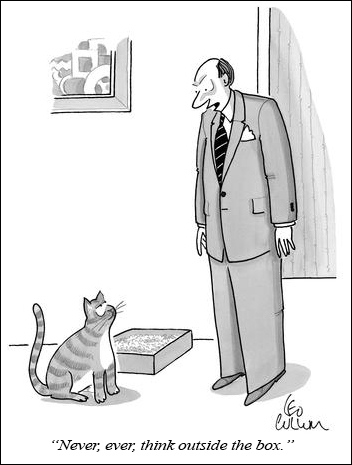
Here is some advice regarding criticism:

Never criticize a man until you have walked a mile in his shoes.  That way, when you do criticize him, you’ll be a mile away and… you’ll have his shoes.

Amazing Logos and Their Hidden Meanings

This is a reprint of an article I found interesting.

Designing logos can be very difficult. When designing a logo you want it to stand out from the crowd yet still be really simple. Sometimes the designer is really clever and makes a seemingly simple logo that includes a hidden message with a deeper meaning. In this article we have 15 logos with such messages, some of which you will have heard of before and some that may be new to you.

Amazon

The Amazon logo is an extremely simple logo and while the arrow may just look like a smile it actually points from a to z. This represents the idea that Amazon sells everything from a to z and the smile is the one on the customer’s face when they bought a product.

Read more.